Retrospective: Devlog Day 3
This post is the third in a series recounting the week of development for Brackeys Game Jam 2022.1, based on the Devlog notes I’ve kept throughout the week! For some context on how I came up with the idea for the game and some early sketches, begin by reading the first entry!
Wednesday was once again a day fully dedicated to work. There were some meetings with friends in my calendar, and I planned to used those as opportunities to have them play test the game before I publish and post on Discord. If you look at the commit history and time sheet for the project you’ll noticed that this is the day with the most commits and time spent! A reminder, perhaps, that it take a lot of work to feel comfortable putting you work in front of others.
Building on top of Day 2
After having built the basic mechanics of the game the previous day, I wrote a list of “next steps” that build up to something I can ship.
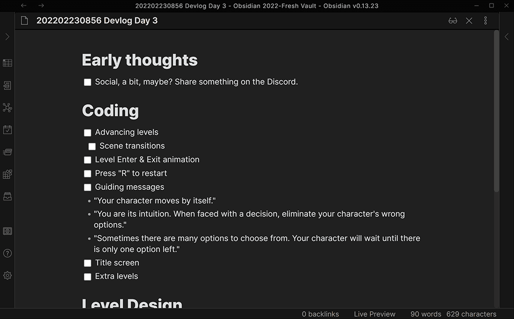
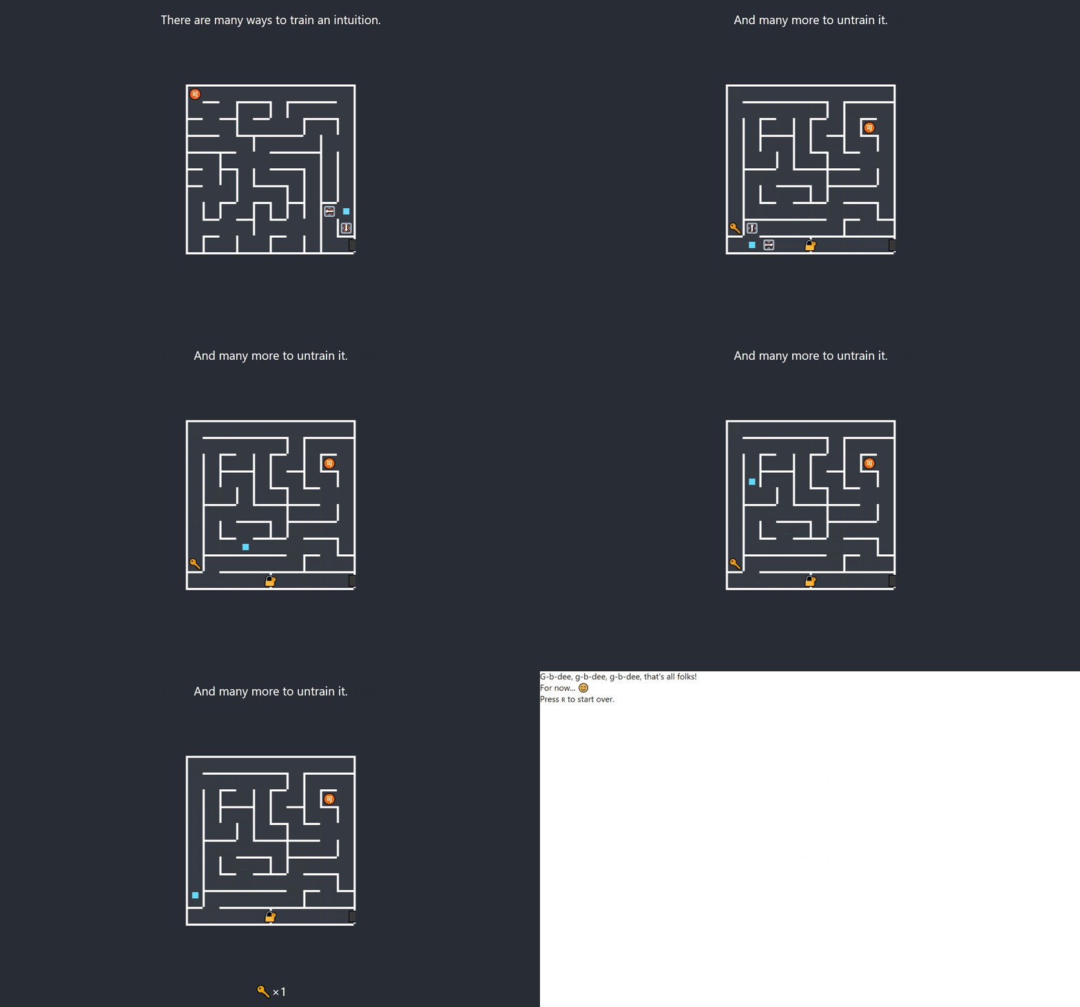
The goal was to ship the game with 5 introductory levels that would gradually introduce the game’s mechanics and hopefully get people excited about the game’s potential and future content. That’s… a tall order.
Features
Begun the day coding some of the features I’ve been thinking about since the night before. This is based on the idea that if you know how your day will start and how it will end, the in-between will be easy to figure out.
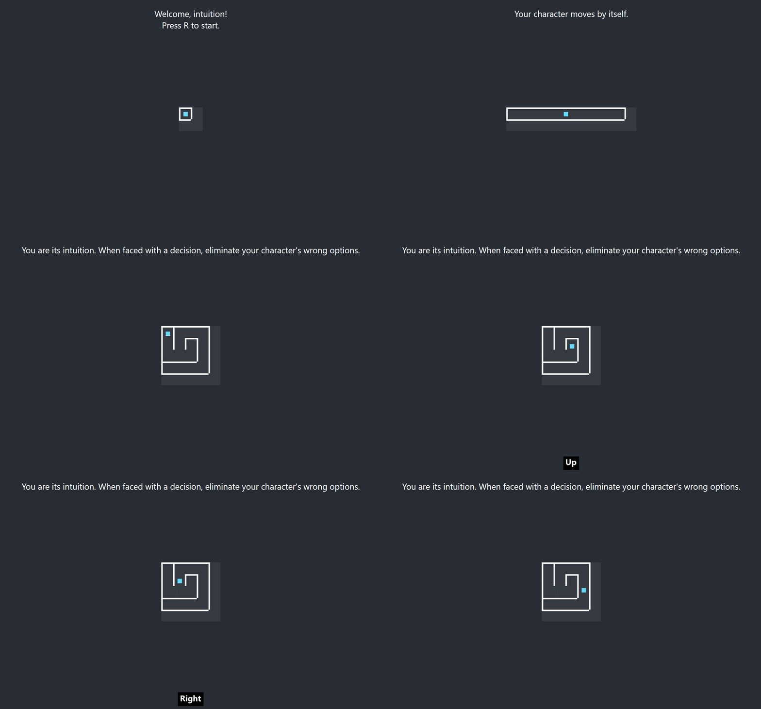
✔ Avancing levels — up to this point… there was only one level
✔ Press “R” to restart — and if you’d get stuck, you’d reload the app
The first two just make sense: once the characters gets to the maze’s exit point, the game should advance to the next level, and if the character gets stuck, there should be a way for the player to start from the beginning.
✔ Guiding messages
Because the mechanic of “eliminating options” was rather unintuitive (and I see the irony for a game called “Intuition”), there needed to be a way to communicate the expectation to the players. This also served as a place to sprinkle a little bit of story through the game.
✔ Title screen
This was necessary because an initial interaction is required before playing HTML5 audio on the mobile, plus it’s best if you don’t just jump into a level where you character starts moving. Because I was trying to save time, I simply created a TITLE_LEVEL as a 1x1 board and added the guiding message.
Level design
Level 3
Using the same ASCIIFlow tool from the day before, I created each next level manually instead of generating them, because I wanted precise control over the player experience.
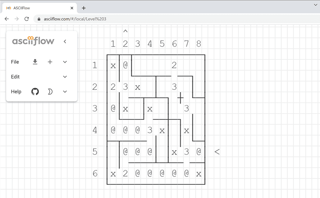
For example, level 3 begins with a 3-way choice at the very start, reinforcing the idea that the player is gradually eliminating options, until there is only one for the character to move into.
Level 4
The boards would get increasingly larger and allow for alternative paths that have different rewards.

For example, level 4 presents the player with the option to either get the coin, or take the shortest path towards the exit. This decision would make even more sense for someone doing a speed run of the game.
Distraction: Generating levels
Designing 10x10 boards became tedius so I decided to spend a little bit of time improving my level design tools: I built a “blank board generator”.
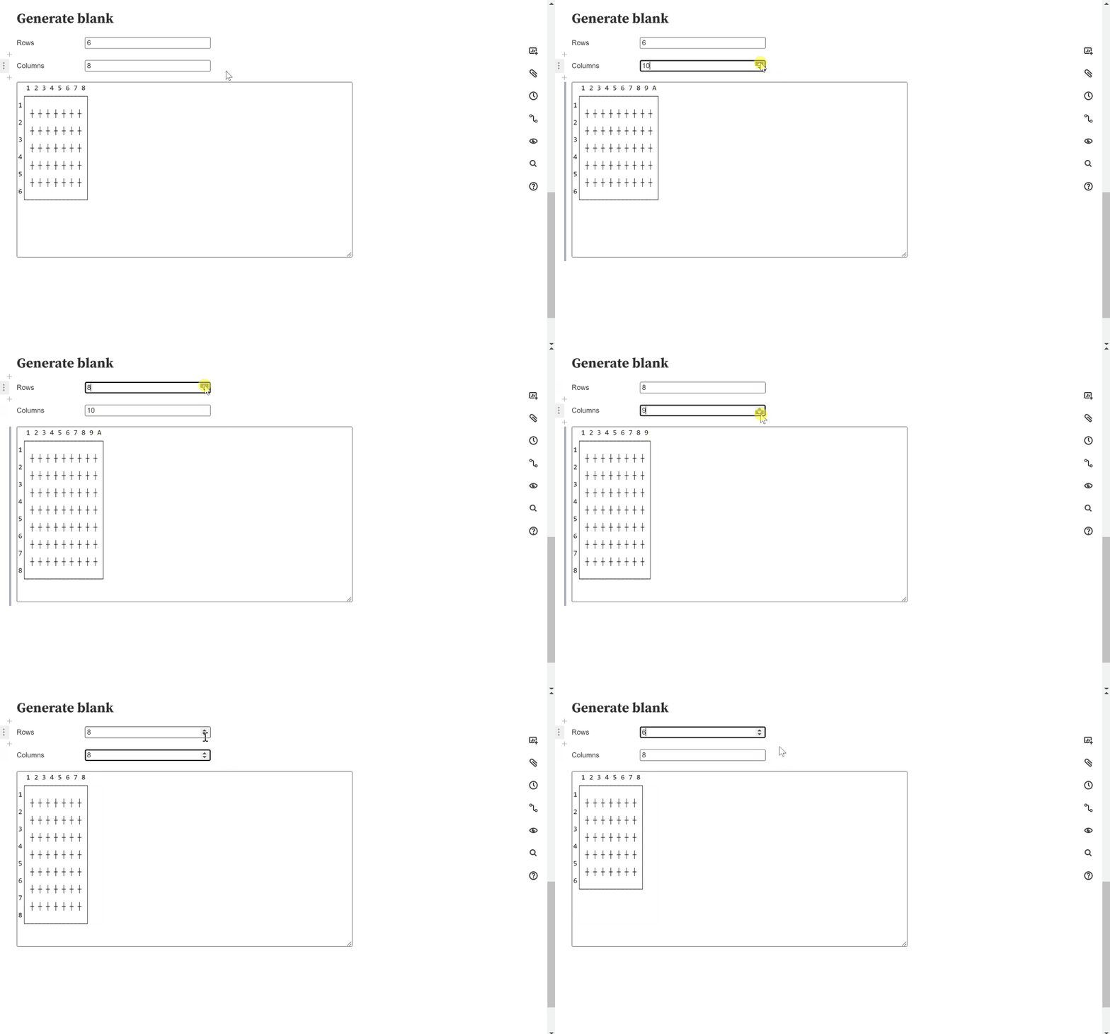 BTW, I’m using ObservableHQ here to quickly prototype using JavaScript.
As a raccoon, you’ll notice, I get distracted a lot by shiny things; especially when the regular work gets boring. Yesterday it was the whole bunch of amends and git shenanigans, today it was writing the code for this blank board generator which was a lot of fun, but in hindsight I used only once, to make level 5.
Note that I could have just built a random maze generator, but at this point I still wanted to have crisp control over the players’ experience, because the levels that I would release would have to be enticing enough for whoever would play the game as well as teach the mechanics.
Level 5
The last level of the MVP introduces a twist, to spark the players’ curiosity and come back to play the final version.
The twist: there’s no way to reach the exit, and each of the items in this level is at a dead-end. This is where players learn that they get to keep items collected even after restarting. I came up with this feature as I was designing this level, honestly, and it was suprisingly expensive to implement, but well worth it for the overall game mechanics.
Polish and more features
To support all of the level goodness that I came up with, I had to add a few more features. And before submitting, I wanted to add a few more cosmetic fixes.
✔ When stuck, display message to restart
The few people who played the game didn’t know what to do when they’d get stuck, so I decided to add this reminder about the R key, which for some reason seemed natural to me by this point.
✔ Cosmetic polish
Mostly “trick of the lights” stuff: Trimming the game board, which is using the rightmost column and bottom row as wall. Center the emoji for the keyboard hints, which looked odd, and I still don’t enjoy too much. Avoid seeming blocked at LEVEL0, which is the corridor at the beginning of the game, where you’re introduced with the idea of your character walking by itself.
✔ Basic inventory system
✔ Display items on the map & Remove items from the map when picked up
The way the game system was designed up to this point, there was nothing sticking around between levels, so I had to add a separate “memory space” outside of the game state where these would fit, and keep the game state local to each level.
✔ Display special walls as emoji
✔ Enable “unlocking” walls
This is all for level 5, and the “unlocking” was actually a hastily written code, way past dinner time with the idea to improve later in the week.
✔ Display exit walls
Again, this came up in play testing of the later levels, where it wasn’t clear what the destination was, unless you designed the levels yourself, or had access to the source code. What an oversight!
Publish
At last, at 11pm I was ready to build the project and publish to itch.io.
By this point I haven’t actually engaged much on the Discord chat, mainly because I found it overwhelming. It was a pleasant surprise to already have a couple of people jump in and test after uploading it. Shout out to Endergaming2546, by the way! Have a look at his Crimson Sanity Prototype as well, when you get the chance!
The game got quite a few plays on its first day, mainly from being featured on the itch.io front and “new and popular” pages. I haven’t actually taken the time to market it yet, since… it was barely a game at this point.
With all those plays, however, I had no insight into whether players were actually successful in completing the levels. For this batch it wasn’t as important, but it would be when designing 15 more levels. Join me tomorrow to have a look at adding some “basic analytics” and take a look at the stats!
Finally, if you’re enjoying this type of content, give a shout-out, please! “Like” button at the top, comment box below, and… maybe go ahead and play the game yourself! Cheers!
Intuition
You play as your character's intuition, letting them know which choices are not real.
| Status | In development |
| Author | Spirit of the Raccoon |
| Genre | Puzzle |
More posts
- Retrospective: Devlog Day 4Mar 11, 2022
- Retrospective: Devlog Day 2Mar 01, 2022
- Retrospective: Devlog Day 1Feb 28, 2022
- As done as it could have beenFeb 27, 2022
Leave a comment
Log in with itch.io to leave a comment.